PROJECT BACKGROUND
Shaklee is a 50+ year MLM company with a strong base of dedicated distributors and members. It specializes in selling nutritional supplements, weight loss products, and green household products.
As UX Director, my role was to set the strategic vision and user experience direction for a brand new app that would be the new essential toolset for the Shaklee Distributor to manage, track and grow their Shaklee business.
DEMOGRAPHIC & CUSTOMER ANALYSIS
First, we talked to Shaklee's current Distributor base to learn everything we could about who they were, how they used the tools available to them today to manage and grow their business, and their existing pain points that we would be attempting to solve with the new app design.
COMPETITIVE REVIEW
Next, we took a look at other MLM businesses, and where they placed along the spectrum in terms of user experience, community, and content. The concept of integrated content was new to Shaklee, so when we looked closely at the leaders in each of these areas, we were able to extract helpful case studies and examples to educate our clients around how paying attention to these things can create an overall better experience for customers.
PERSONAS & USER JOURNEYS
We dove deeper into crafting the personas and journeys of a handful of Shaklee distributors to understand better how they will interact with the digital tools, at what frequency, and what sort of features, content, and functionality will allow them to achieve their goals. The final outcome is a set of recommended (and ranked) content, functionality and features that all distributors will find valuable. This serves as the beginning stages of a feature roadmap.
DISTRIBUTOR JOURNEY
We also looked at the "product lifecycle" of a Shaklee customer to help identify the different types of users, and how they can grow from trying the product, to using it regularly, to selling it, to making a thriving business out of selling it.
BUSINESS REQUIREMENTS GATHERING
Once all the customer research was concluded, I led a series of white-boarding sessions where we dove very deep in understanding Shaklee's business model, including the ways in how their distributors manage and track their business, and Shaklee's various incentive programs that drive adoption and growth. Because we were designing an app to help distributors manage and grow their business, it was essential that we understood all the intricacies of how Shaklee operates from their perspective.
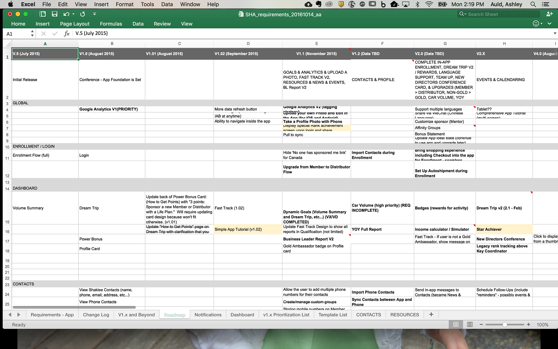
ROADMAP
Our timeline was very ambitious. We had 3 months from day 1 to get an MVP live in time for the annual Shaklee Conference which was going to be the product unveiling. Then, quick updates every month thereafter to add more functionality to the product. Part of my job alongside our Project Manager was maintaining and managing our project roadmap, and helping to manage client expectations about when they would get features live in the app.

SKETCHING AND BRAINSTORMING
Now that we understand who we are designing for, and what information we needed to present; we went about the process of brainstorming how this could be displayed to the Shaklee distributors. We wanted to create a design system that was very simple, easy to use, and optimized for a mobile screen size. Shaklee's business is complicated, with lots of tiers and rules, so the challenge was finding a system that could be informative and helpful for a distributor without being overwhelming.
EXPERIENCE MODELS
After white-boarding, we crafted a formal experience model which helped to detail the way in which our dashboard would display Shaklee's different incentive trackers. So every distributor could track their monthly progress towards their goals. Tapping on the card would turn it over and give them a more detailed view of the information that the tracker was displaying. Every card had a CTA button for a way to take action to help achieve the goal.
WIREFRAMES
The next step was to wireframe out the user experience for our concepts. We went through an iterative process with our Visual Design, Engineering Team, and our Client's business, marketing and engineering teams to make sure everyone understood the flows and how the business requirements translated to these designs.
The design had some challenging front end data visualizations that were crucial to project success. Our lead Engineer was in Texas, and I was probably on hangout with him every other day, explaining the latest designs and articulating the business cases so that he was up to speed. We had three months to get an MVP live, so working closely with him was critical in getting the project live on time.
VISUAL DESIGN & PROTOTYPE TESTING
When Visual Design and UX were in a pretty good place, we crafted a prototype and put it in front of a handful of Shaklee Distributors to get their feedback. We did this twice before coming up with the final model for this product.
FUNCTIONAL SPECIFICATIONS
Fluid was in charge of building the front end, but the backend was all on Shaklee's side. The UX team crafted a specification document to help both teams coordinate on how the app would create and display data, and determine what API's (if any) needed to be created for it. It was an instruction manual both for the user experience portion of the design, but also what kind of data would be displayed and how the customer would interact with that data.
Questions? Email me at aauld@ashley-arts.com!
The app was live in the app store from 2015 - 2018. However has since been taken down. It had 4.5 stars.