PROJECT BACKGROUND
At the time of this project, Fluid (and I) had been working for a long time with The North Face. This was the first large scale redesign they were taking on since 2008. I was the Assoc. UX director on the project, in charge of overseeing all UX deliverables, providing oversight, guidance and working together with the client to create the vision for the new website.
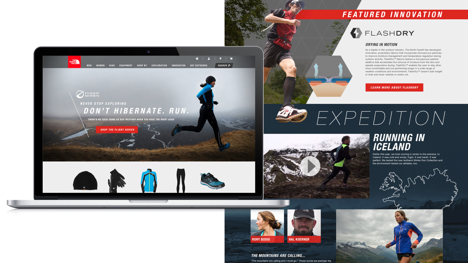
The existing site had a lot of great content, but very silo'd, often living on dead end pages, and not shoppable. Therefore, in addition to creating a great shopping experience we wanted to find ways to integrate the editorial content into the shopping experience. Content + Commerce integration is a challenge for a lot of ecommerce websites, but their new platform was going to allow for it with robust CMS capabilities.
CONTENT STRATEGY
During the initial discovery phase, the UX and Strategy team at Fluid did an in-depth analysis of all current site content to make recommendations for how the content could be better served and integrated within the shopping experience in the new site. This helped to inform the new site architecture.
SITE MAP
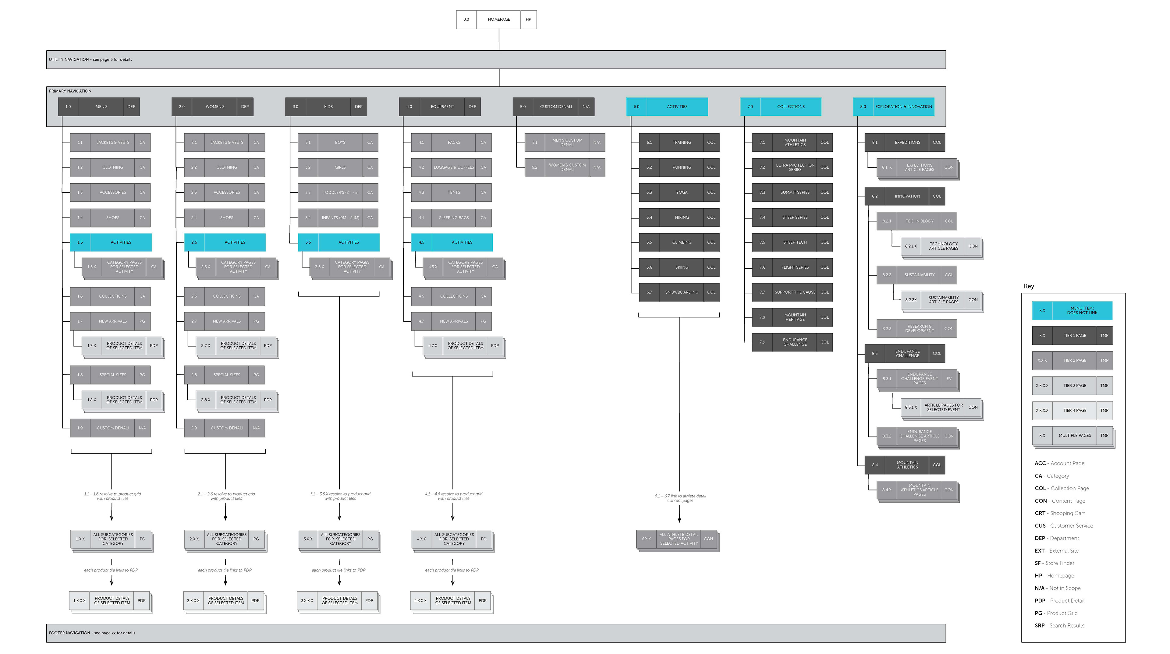
Based on the content strategy, Fluid made an architectural recommendation for how the silo'd content could be redistributed on the shopping pages. Each major department had multiple ways to shop, not just by category, but by activity or collection.
ZONE DIAGRAMS
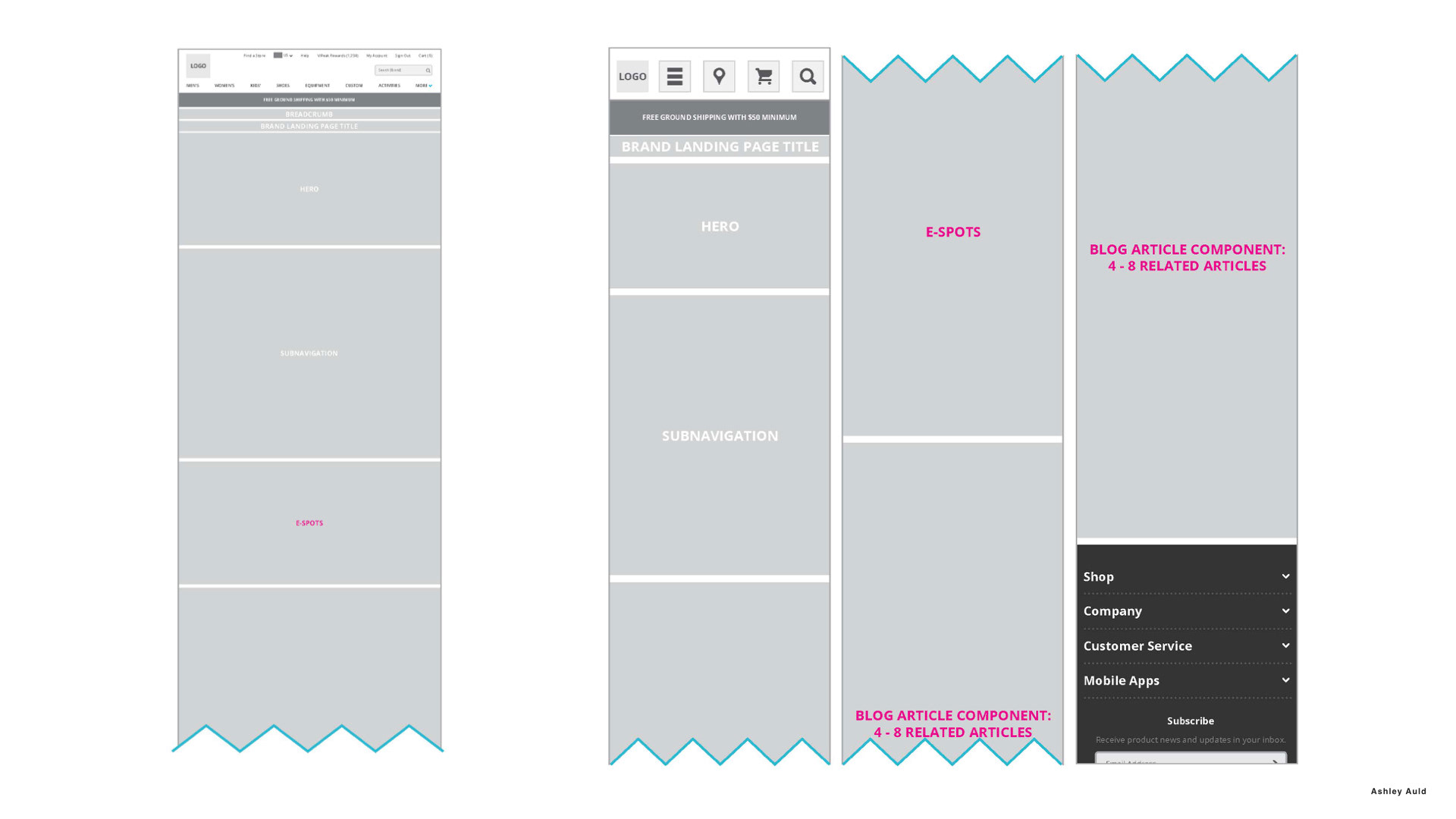
Next, we created zone diagrams to illustrate broadly how content would be organized and structured within the new pages using a "plug and play" modular strategy, designed to allow maximum flexibility for The North Face's marketing team to experiment with different messaging, promotions, and content hierarchy.
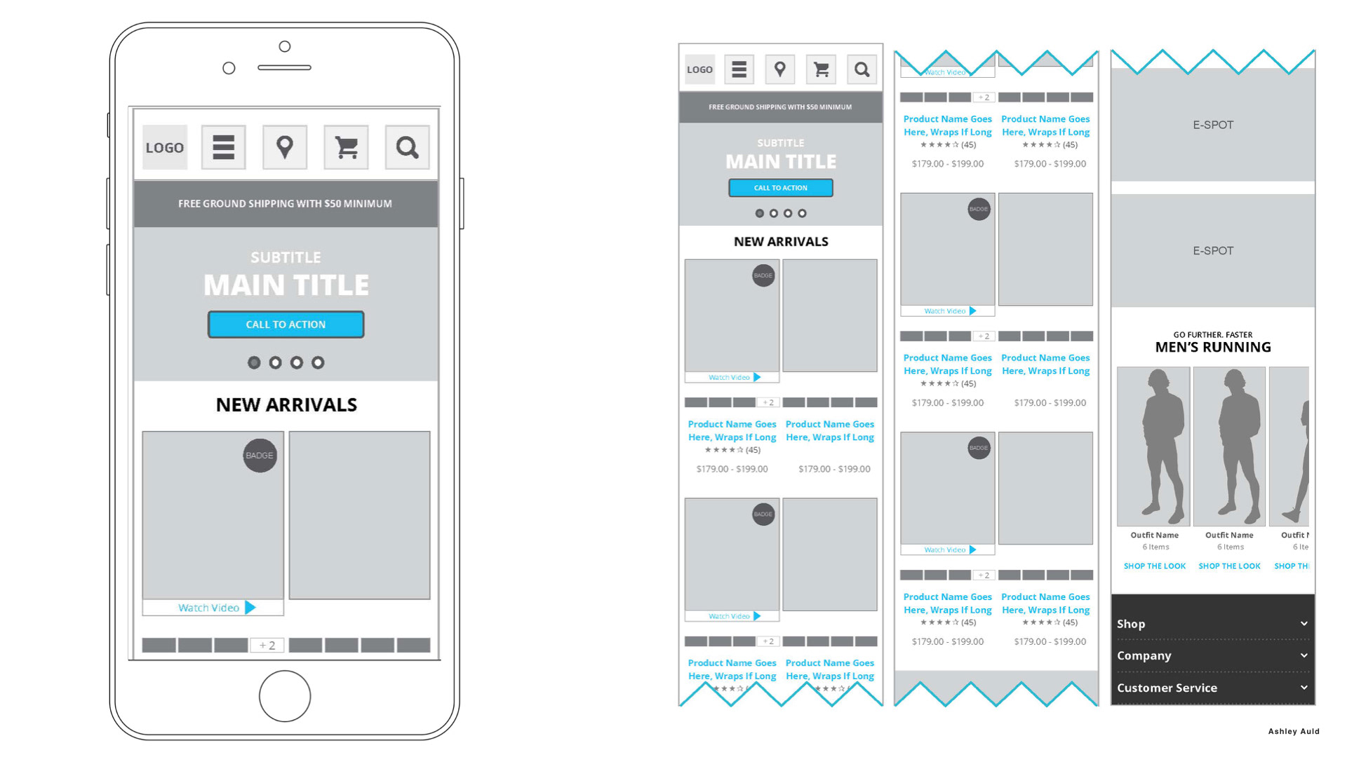
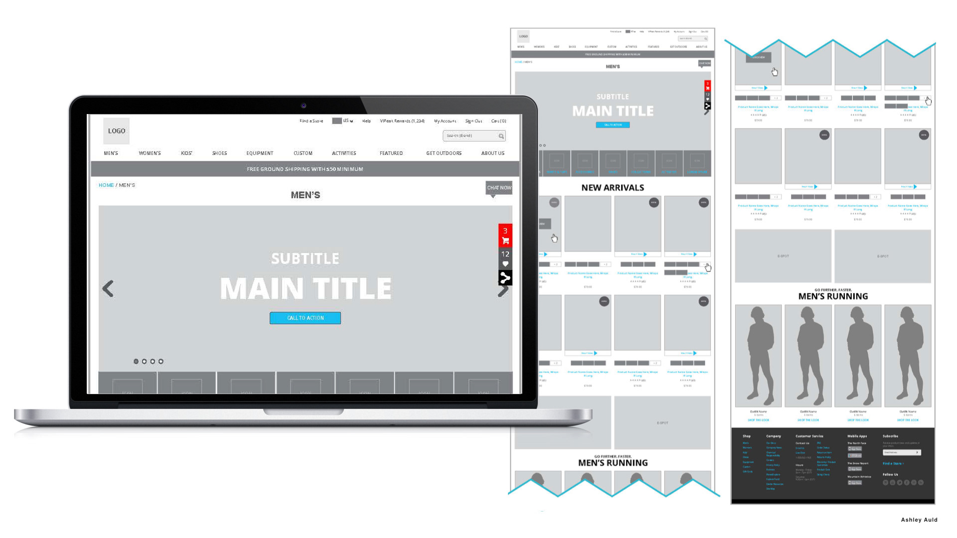
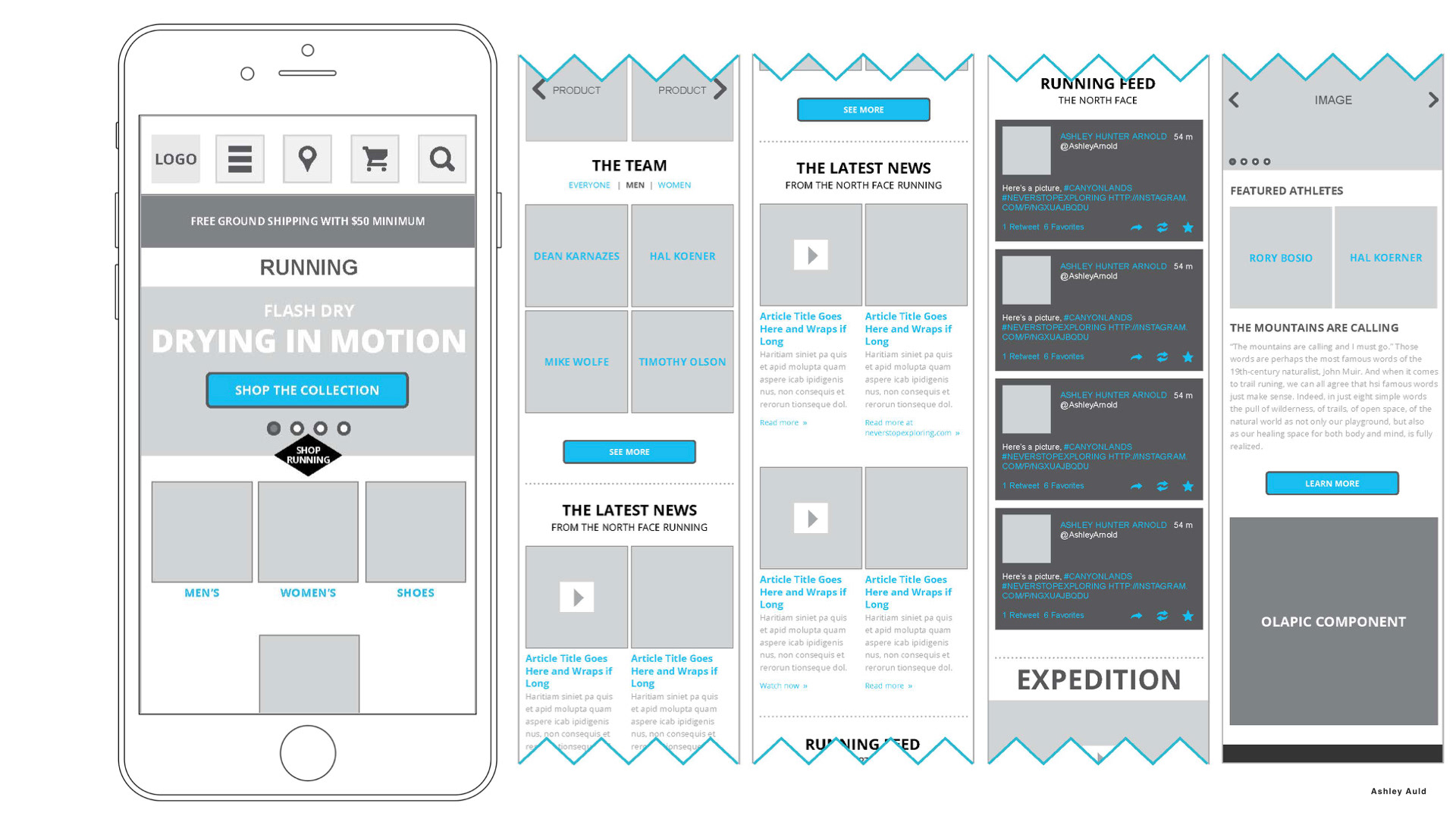
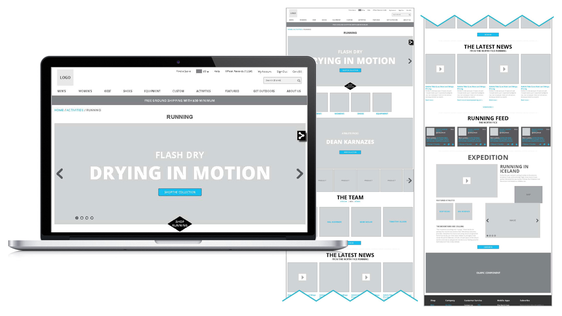
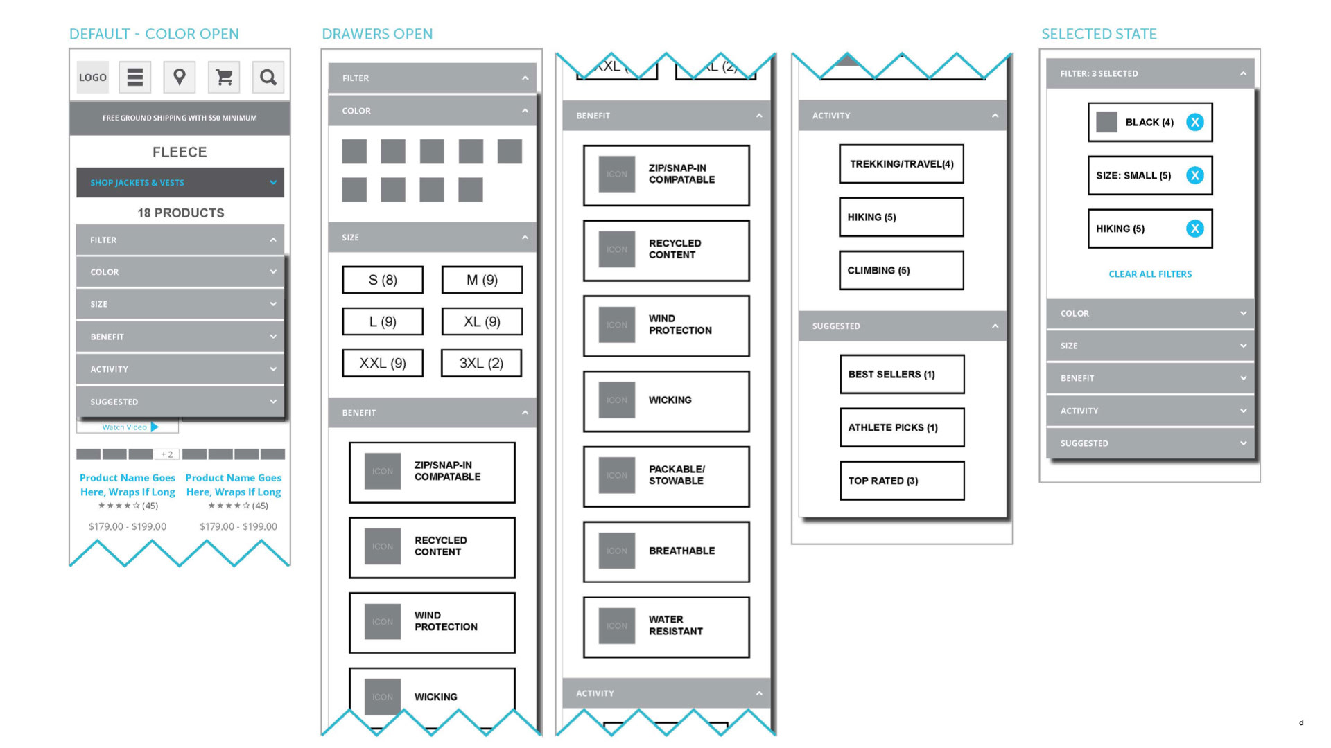
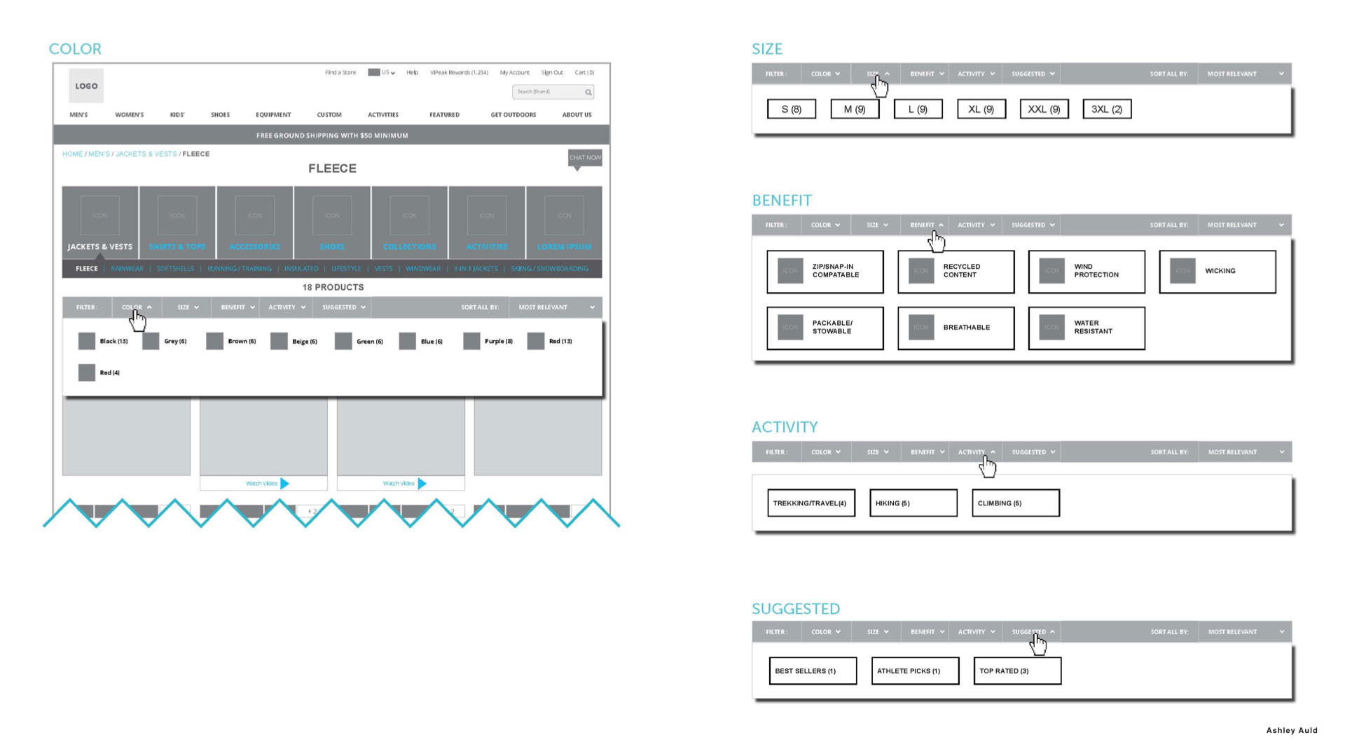
WIREFRAMES
Using this module based strategy, we brought the wireframes up to higher fidelity, showing how the applicable content could integrate with shopping based on the pages the user was viewing. (for example, on sports pages we could integrate content with athletes, expeditions, or technologies specific to that sport.)
Category Page
Sports Page
Component Designs
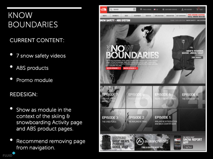
Where necessary, the wireframes illustrated additional details and interactions on the pages using cutsheets.
VISUAL DESIGN
These were some early concepts, the final designs can be seen on thenorthface.com.