DIGITAL ECOSYSTEM REDESIGN
For customer research samples, please see Shaklee Connect.
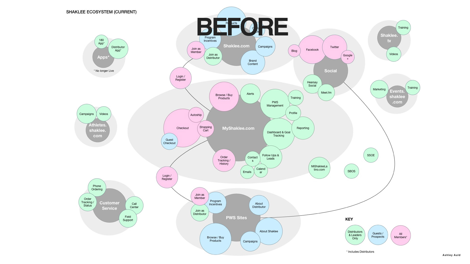
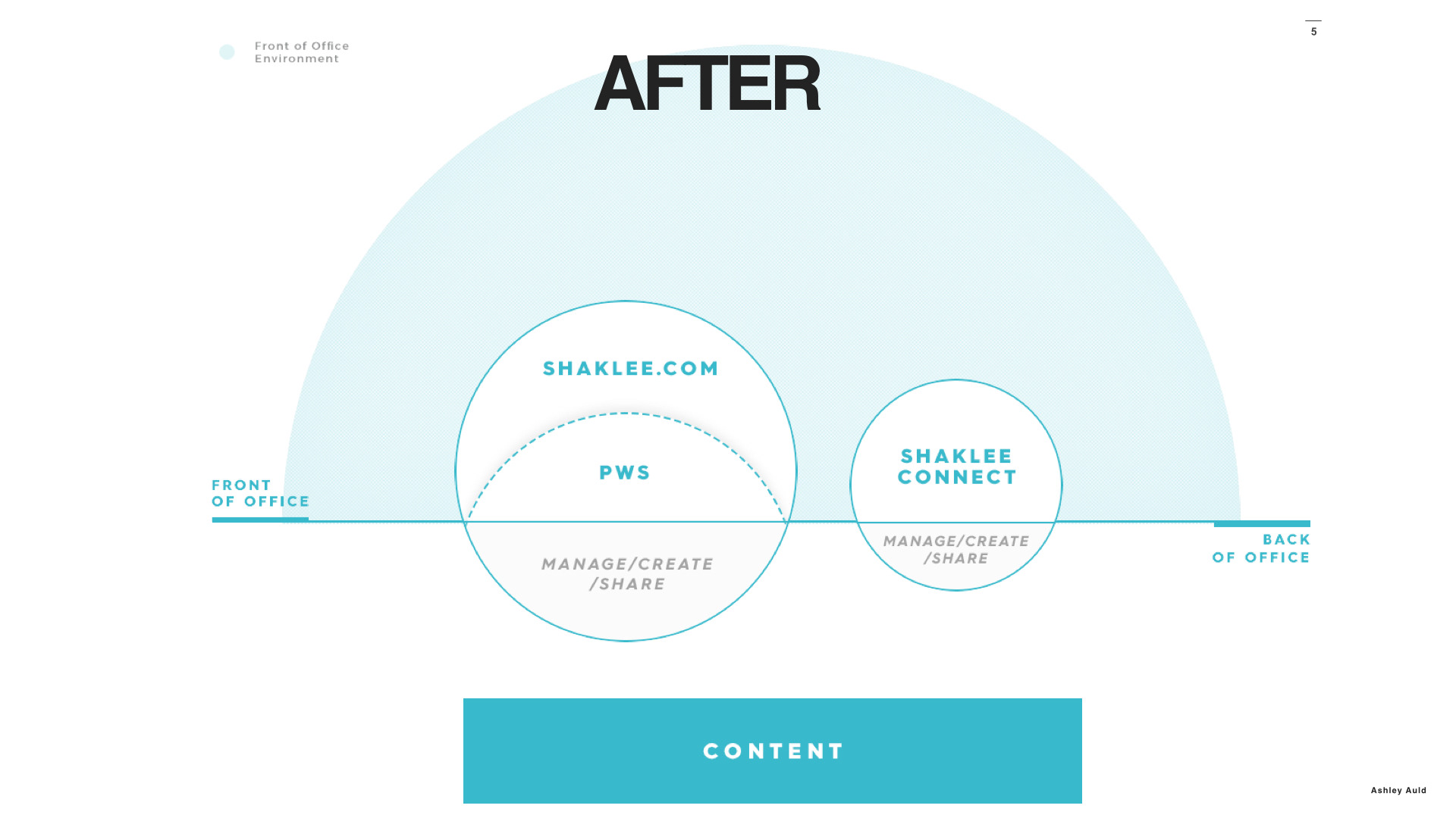
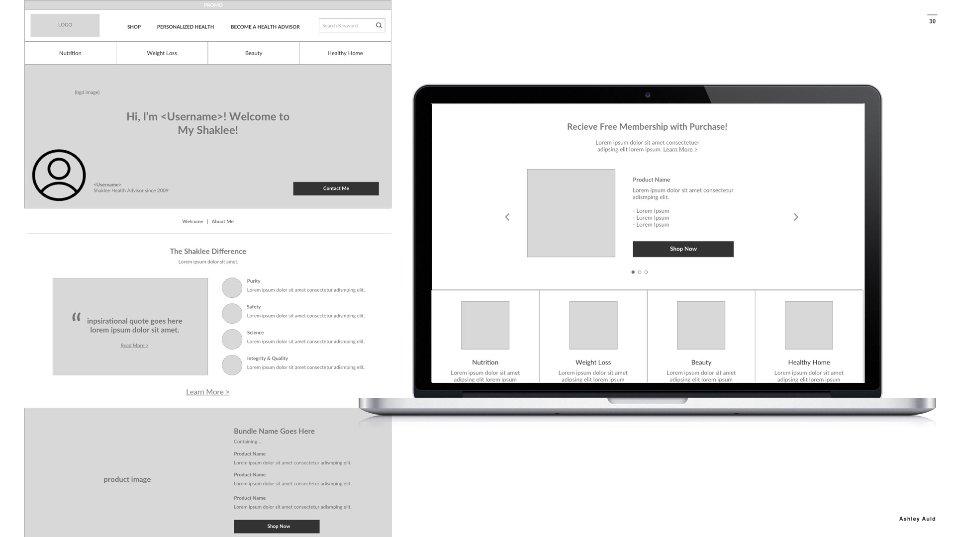
After the success of the Shaklee Connect projecst, Shaklee engaged with us again to re-imagine what their ecommerce website experience could look like. Their existing digital ecosystem was very fragmented. Shaklee.com was a different website than their e-commerce store, and their distributors also had their own separate websites (what a mess!) The system was not scalable, as well as difficult to manage and maintain. The first thing we did was take a new look at how their "digital ecosystem" could be organized so that everything would be on the same platform. This would create a cohesive user experience, so users who come into the site via a Distributors unique URL didn't feel like they were leaving the site to go somewhere else the minute they started shopping.
WIREFRAMES
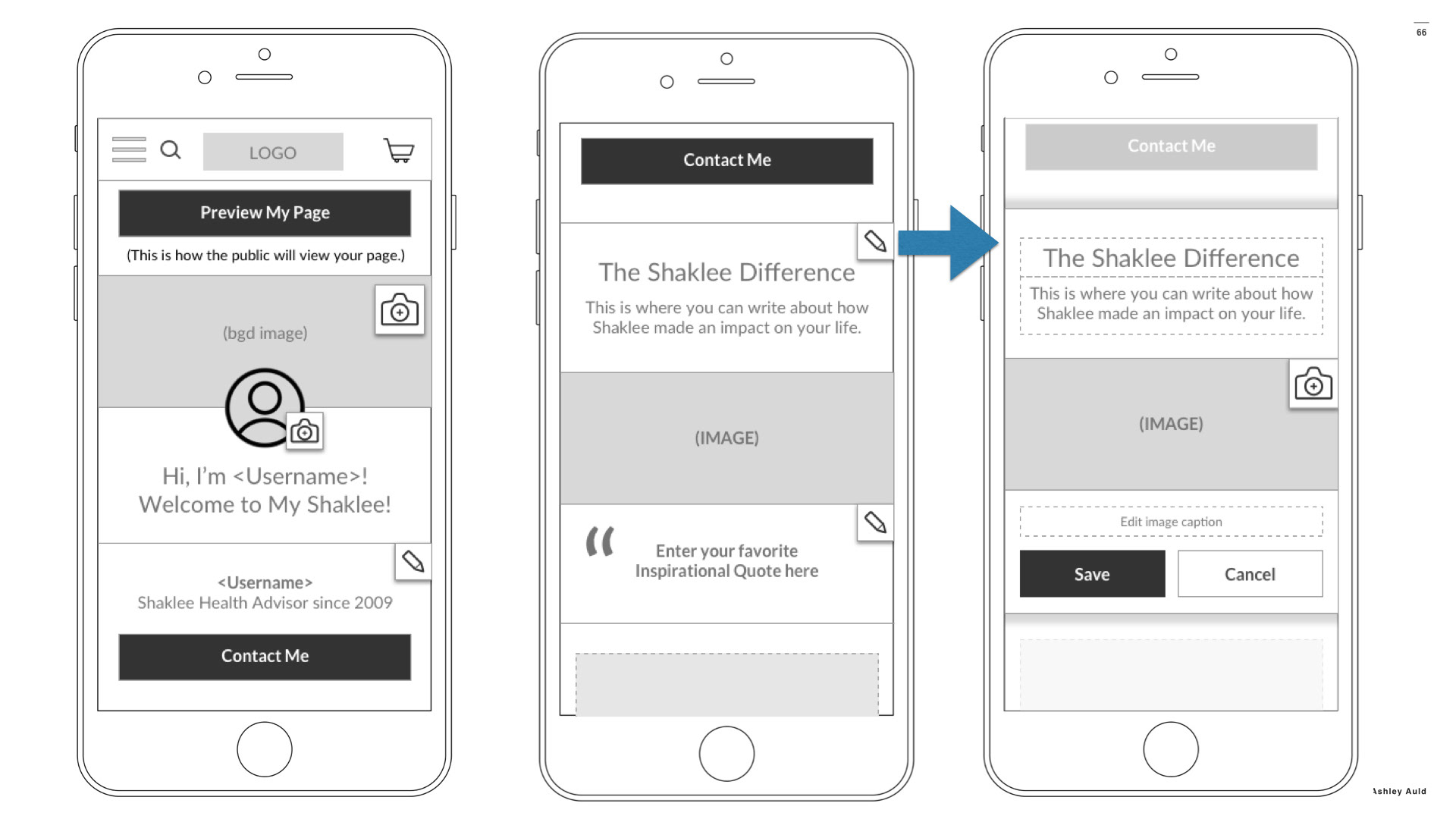
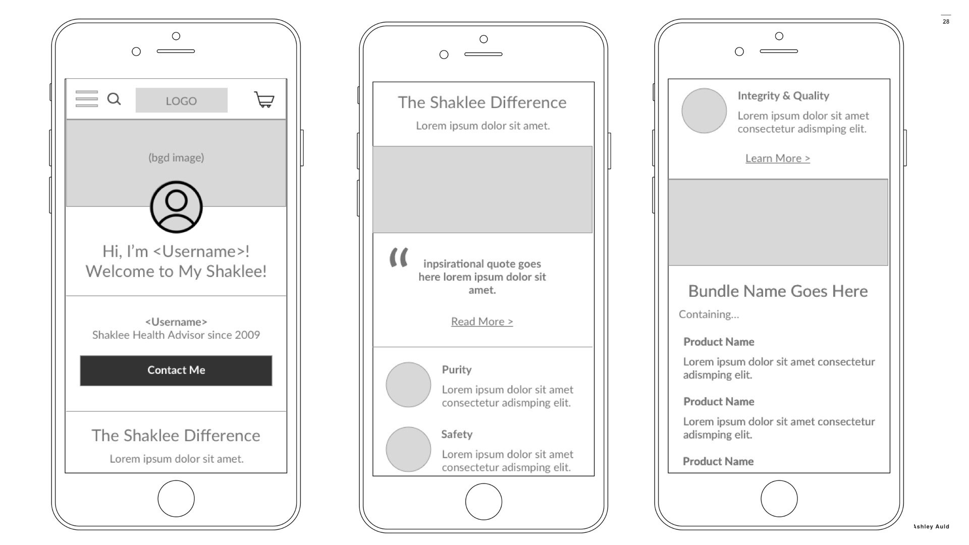
The new ecosystem included not only Shaklee.com, but integration with the "PWS" (Personal Website) which is a website that a distributor gets when they sign up to sell Shaklee products. Based on our experience and interviews with the Distributors, we know that they all have different ways they like to market themselves and different priorities for how they want to grow their business. So, we created a flexible WYSIWYG type of interface that allows a distributor to customize their PWS with their own personalized messaging, giving them flexibility but not requiring them to know HTML or code.
____________
This is what the visitors would see...
_________
_________
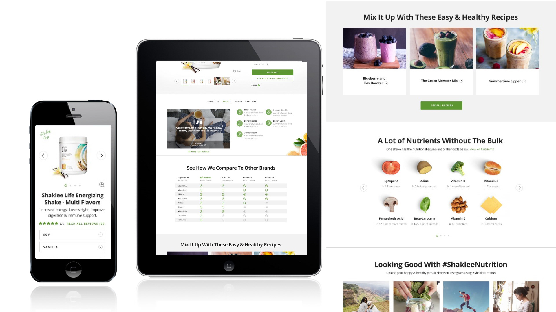
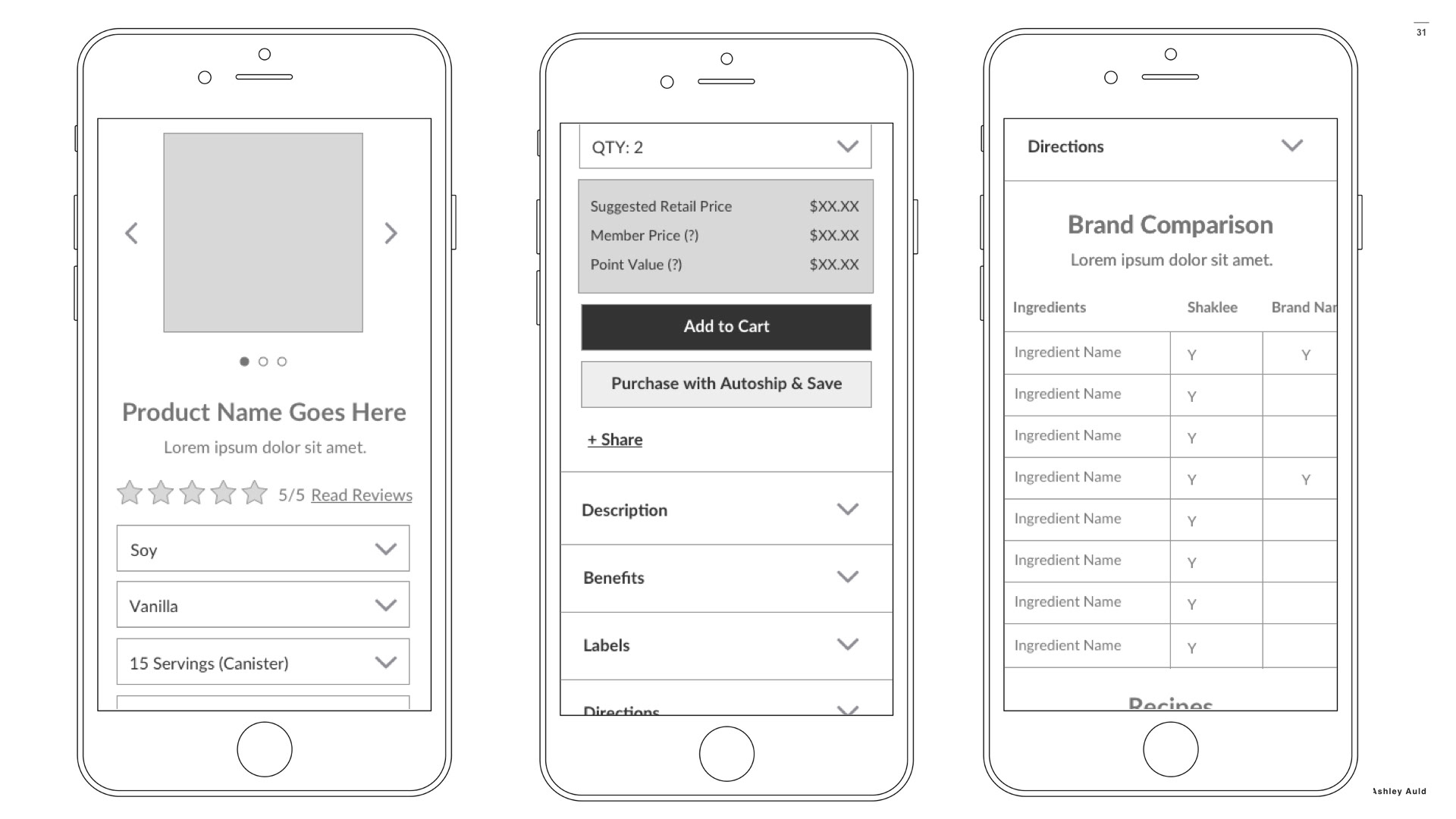
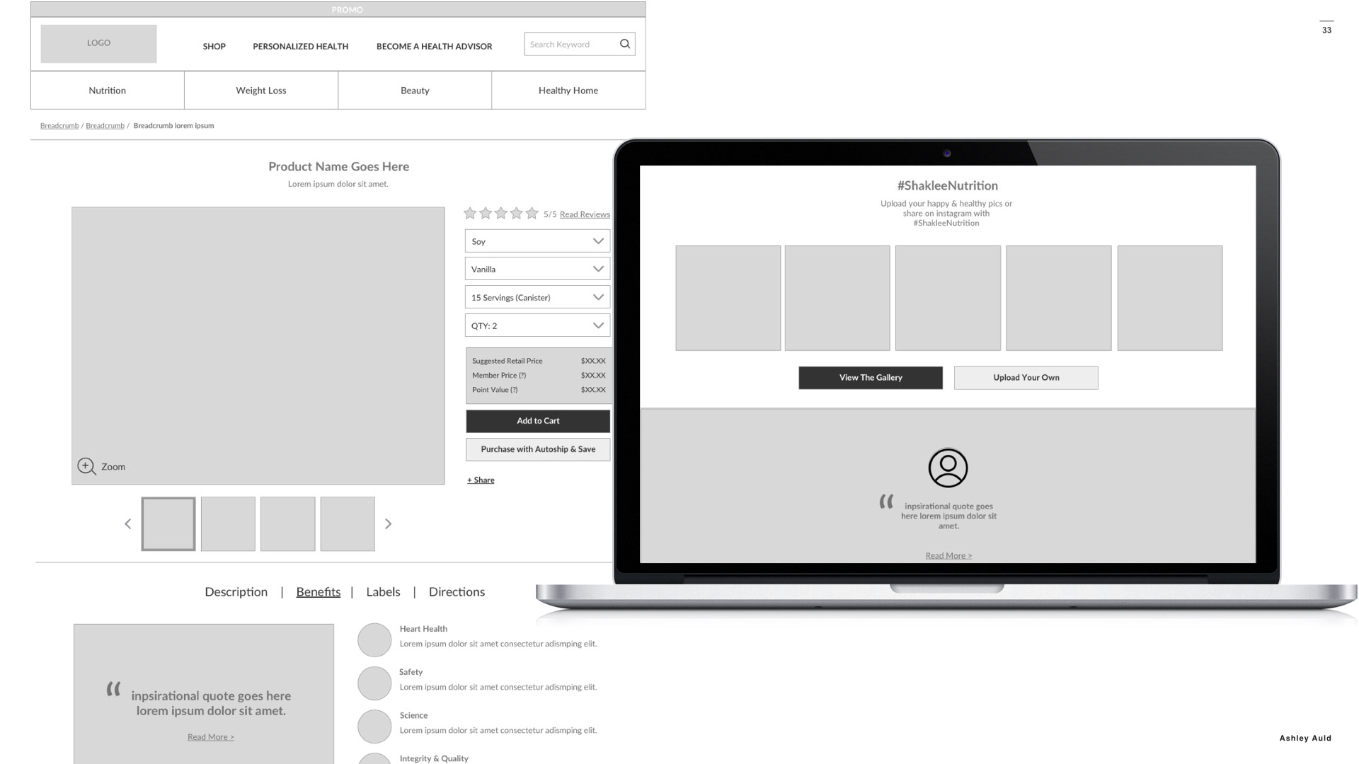
PRODUCT PAGE
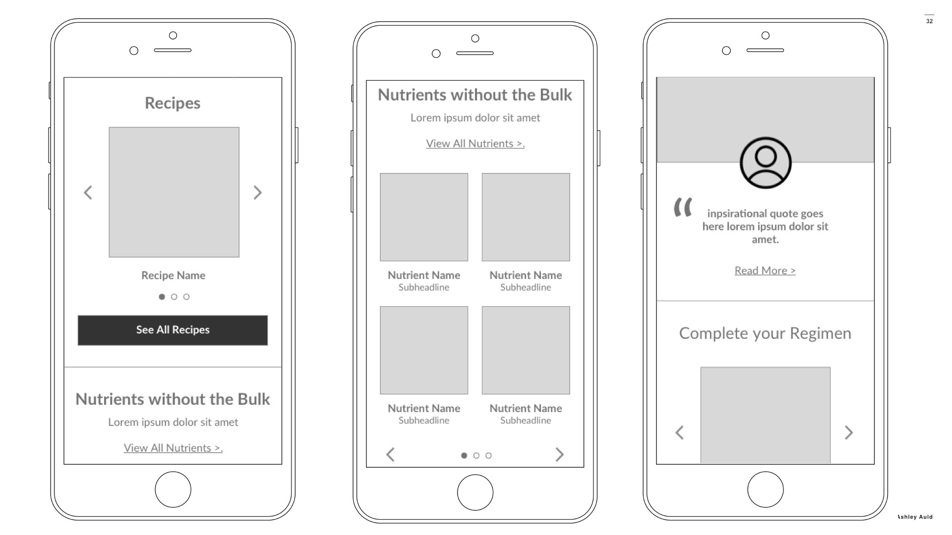
It was important to both distributors and the Shaklee client that the product pages included content that promoted the benefits of what makes Shaklee products different from the competition. Features such as comparison tables, informative modules that detail the number of vegetables or nutrients a person would have to eat in place of a single vitamin, etc...
_________
__________
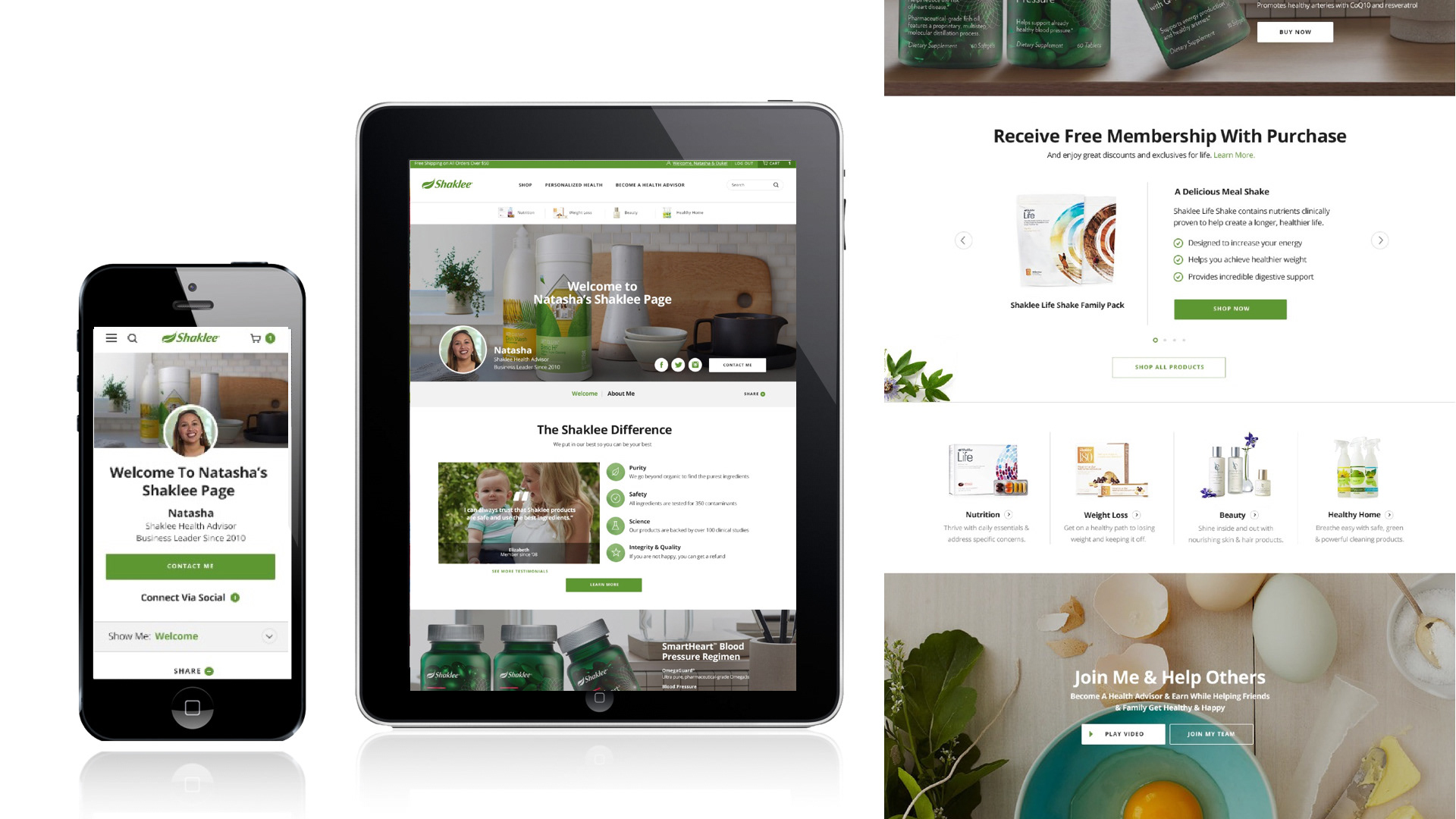
Visual Design
_________